Rethos
Packaging Design
2020

PROJECT OVERVIEW
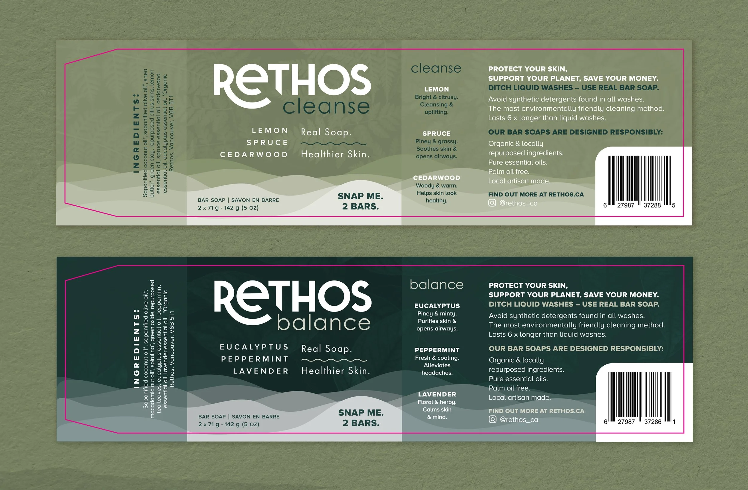
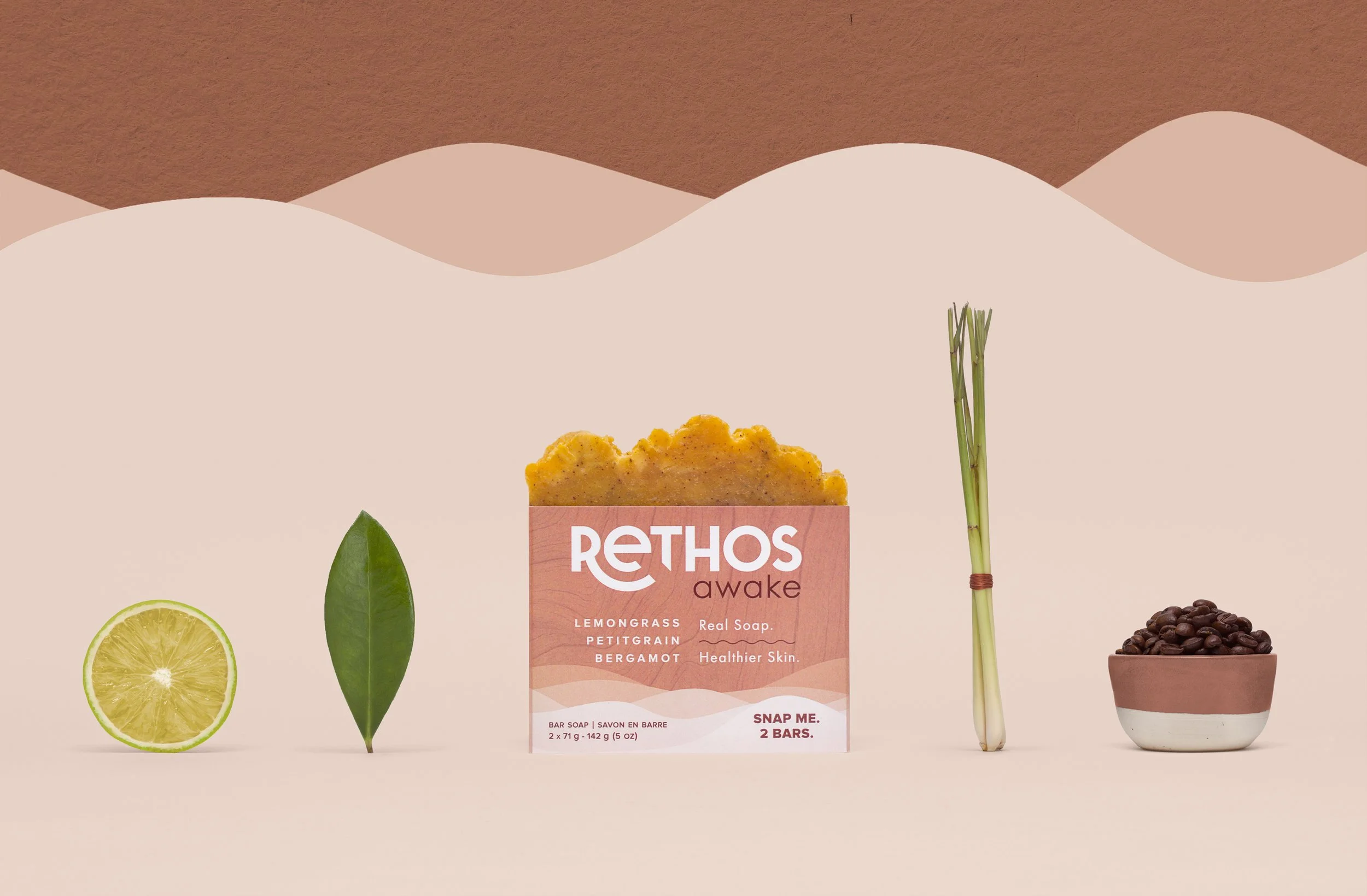
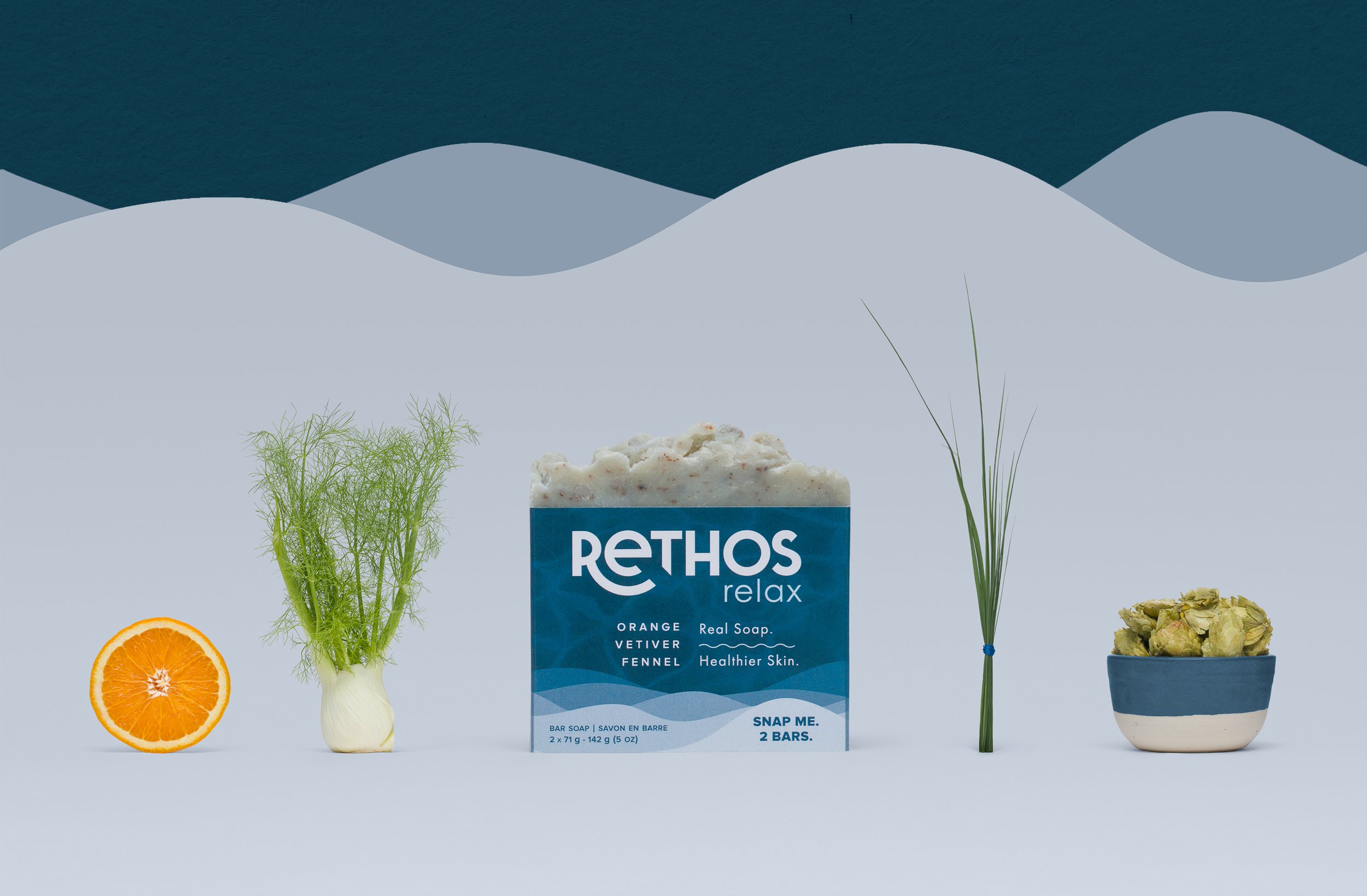
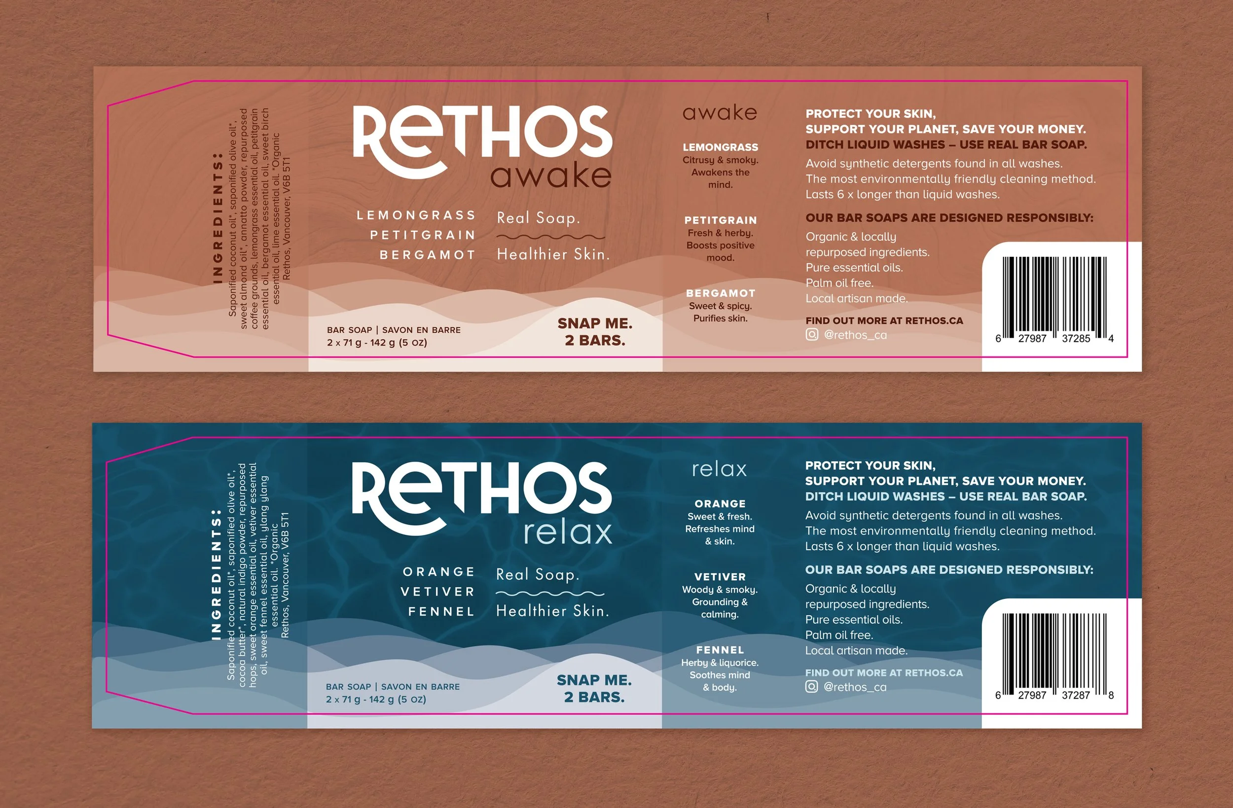
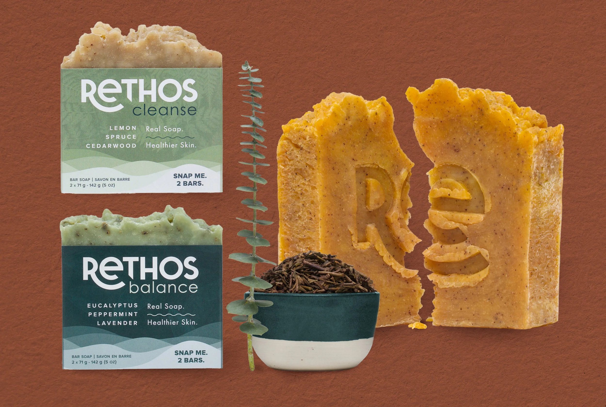
Rethos - is a portmanteau of RE (in reference to & again) and ETHOS (the characteristic spirit of a culture/community). The intention of the founder, Chris, was to help redefine what it means to be sustainable with a focus on positive, permanent change in the way we consume products. The company aimed to have sustainable wellness products, such as bar soap, to help maintain a balanced lifestyle.
GOAL
The visual representation of the Rethos brand depended on a multi-sensory approach to design – it's not just what you see but what you hear, smell, and taste, too. Leveraging the human senses was the key to creating a visual language for the company and to cultivate trust with Rethos’s consumers.
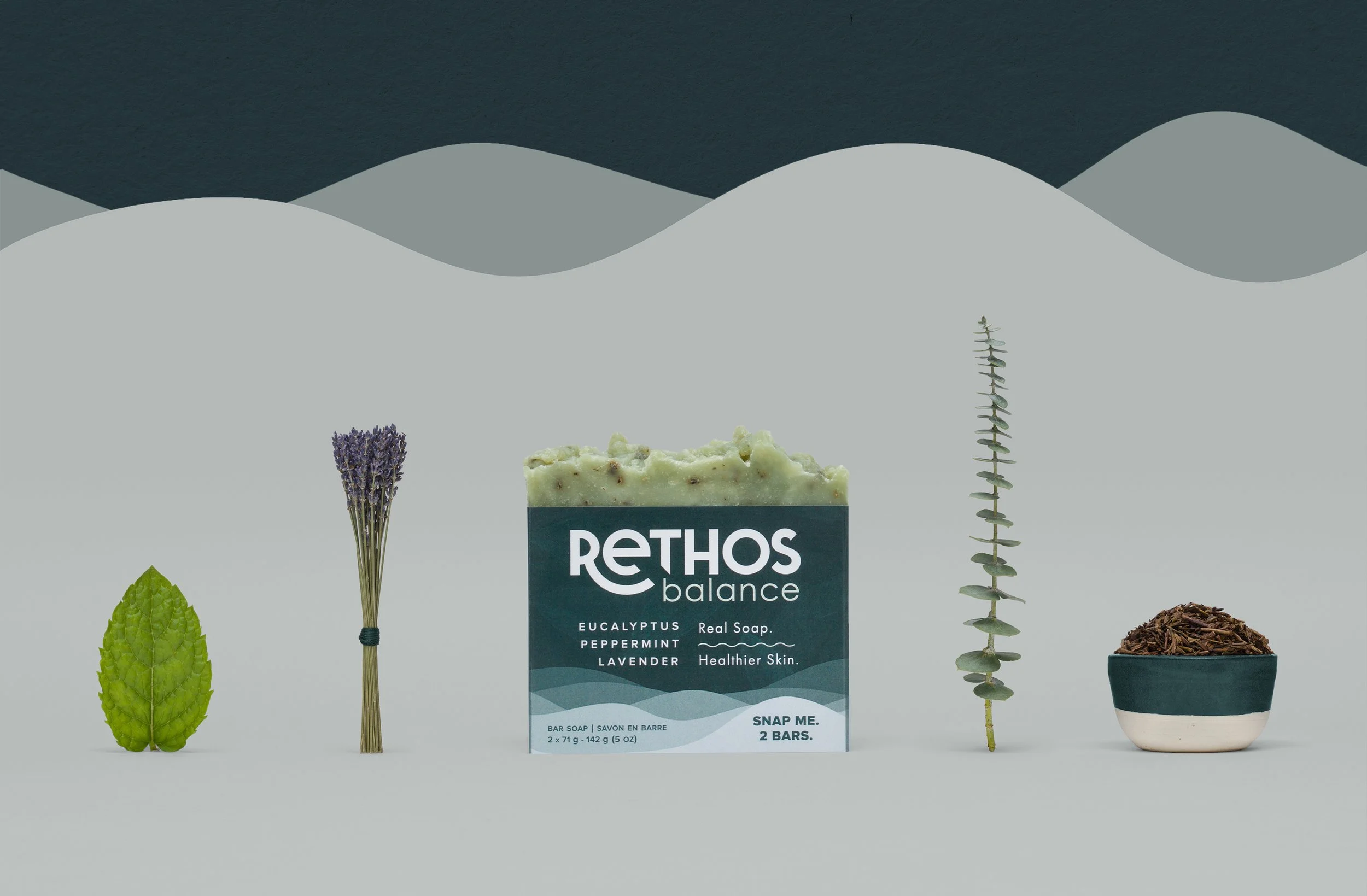
The intention of the project was to create a look and feel that was playful, thrifty, and holistic. Rethos had to evoke the feeling of placidity in nature and signal to the consumer that the products were in alignment with living life in an environmentally conscious manner. Textures, imagery, and elements found in nature were used as the guiding components of the design.
PROCESS
Encompassing Rethos’s business objectives, project summary, communication strategy, category competitor research, brand tone, and a detailed target persona, I produced the overall visual language.
Deliverables included the creation of a brand logo, wordmark, colour palette, and comprehensive guidelines for overall application. Following establishing the foundation of the brand identity, I developed designs for product packaging, business cards, social media templates, presentation templates, letterheads, website design, and activation materials, such as in-store signage.
ROLE
Graphic Designer
TOOLS
InDesign, Photoshop, Illustrator