Arbutus Fitpass
Branding
The Arbutus Club
2020
PROJECT OVERVIEW
The Arbutus Club has one of the most comprehensive selections of fitness and wellness classes offered by any private club in Canada. Launched in 2019, the Arbutus Fitpass is a monthly fitness program featuring 35 weekly classes, including strength, cardio, cycling, yoga and aquafit. Members that participate in the Fitpass receive access to a plethora of different health and workout programs for a discounted fee.
GOAL
The Arbutus Club Recreation Services department sought to increase participation in their Group Fitness programming. While the majority of athletic programming at the club required registration on a class by class basis, the Fitpass enabled members to gain access to a diverse range of classes. Participants could try different group fitness classes without having to commit to registering for a class for an entire season. Increasing accessibility and participation in group fitness classes was predicted to expand general attendance.
CHALLENGE
Fitness and exercise trends are constantly changing. In the last two decades, health clubs have had difficulty in member retention for group fitness programs. Workout culture is closely tied to fashionability and what is considered in vogue. Competition by exercise specific businesses, such as yoga and Pilates studios, or slick fitness concepts, like Barry’s Bootcamp or Equinox, saturate the competitive landscape. The call to action for the branding and marketing campaign needed to place an emphasis on the comprehensive nature of The Arbutus Club’s group fitness program. It was a one-stop shop for health and workout needs.
ROLE
Art Director, Marketing Strategist, Graphic Designer
TOOLS
InDesign, Photoshop, Dreamweaver, After Effects, Premiere Pro
PROCESS
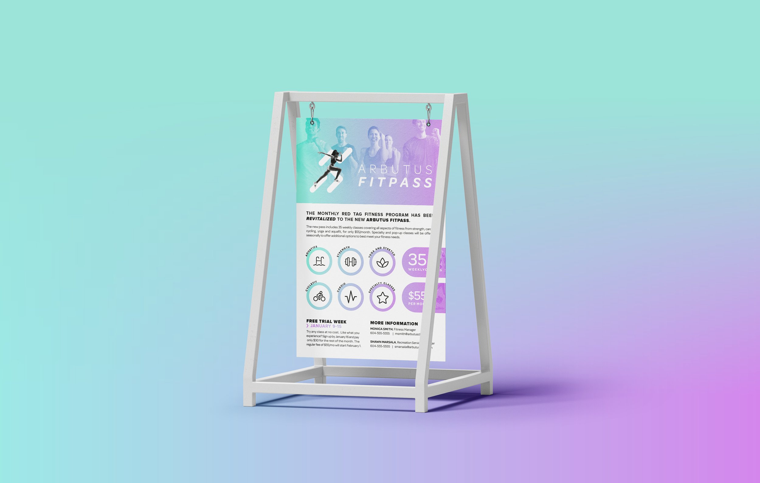
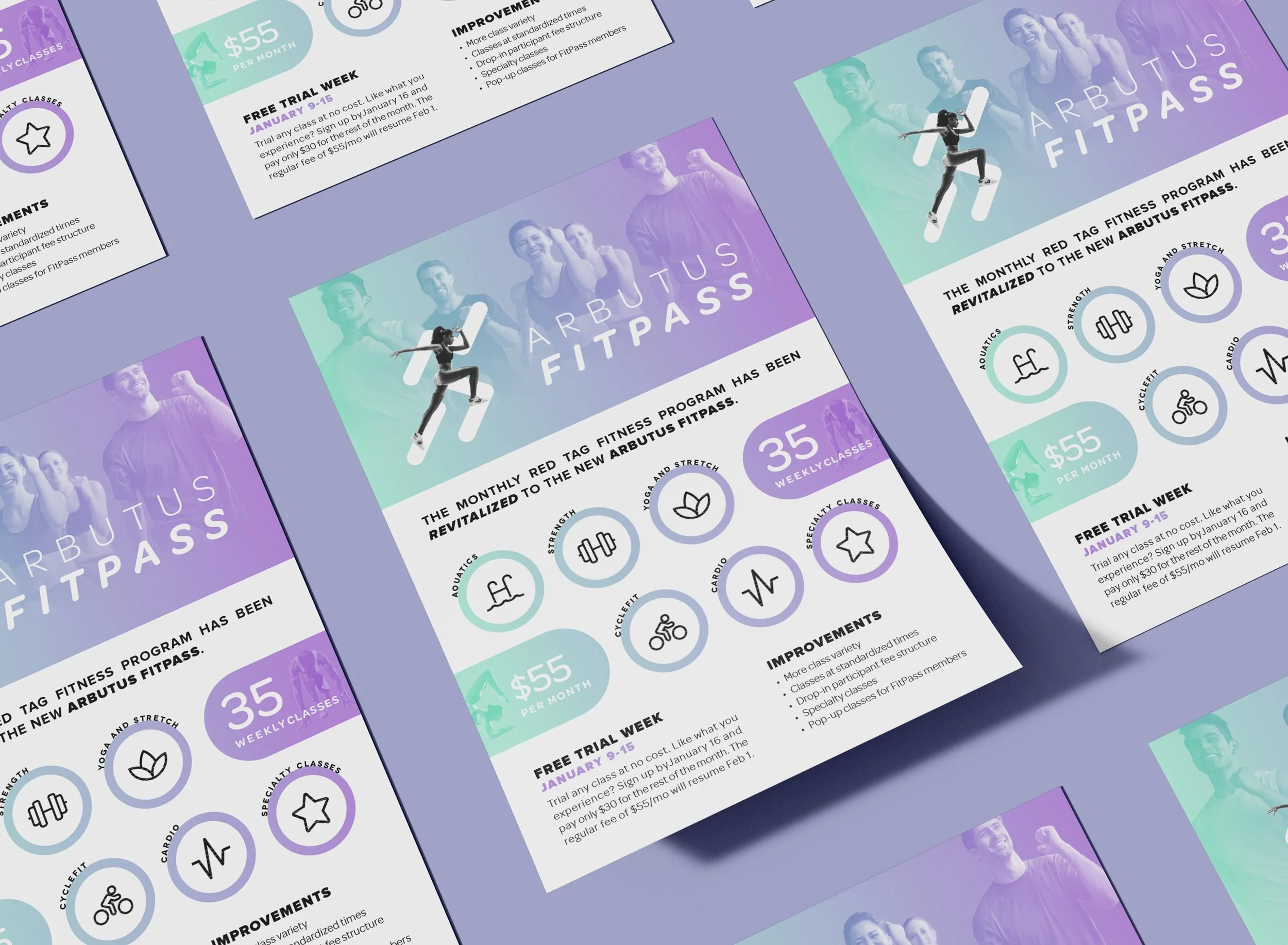
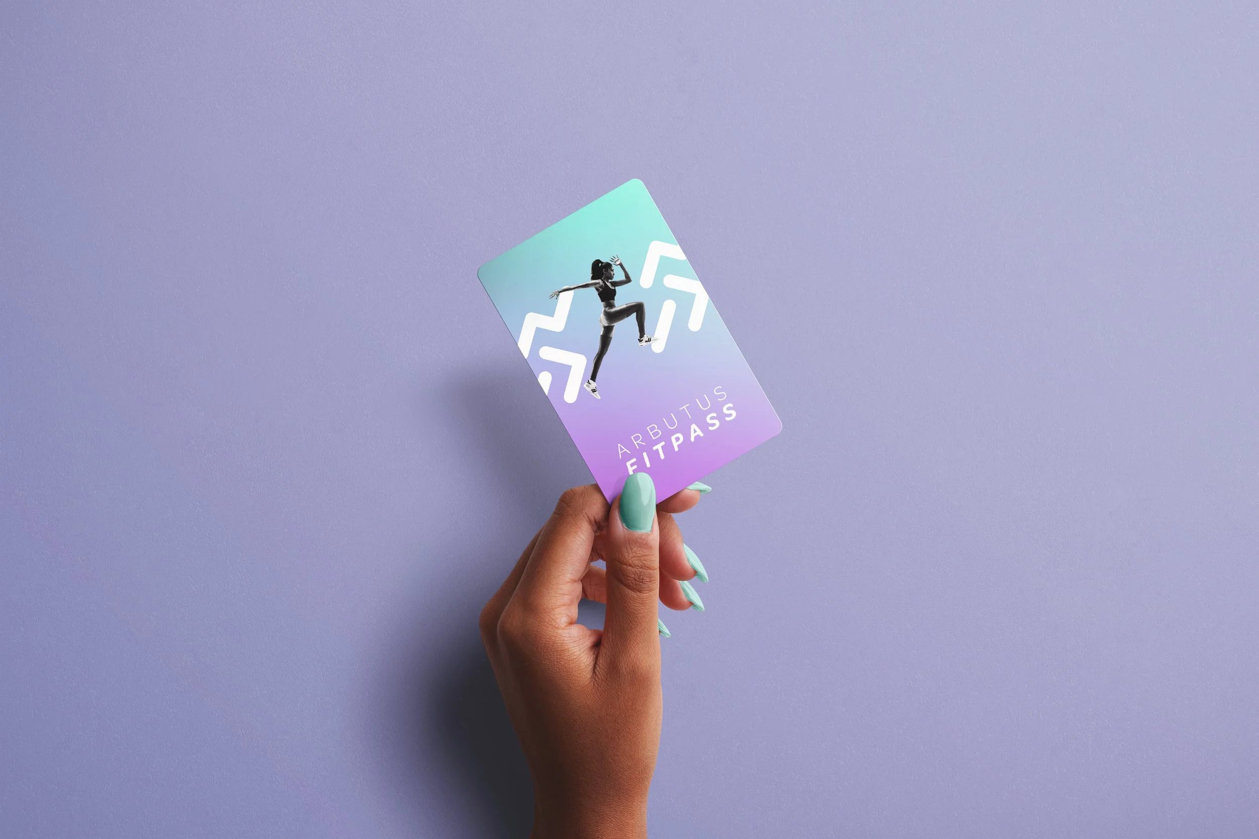
Working alongside The Arbutus Club Recreation Services we began with initial sketches for the logo and colour palette. The logo and colour palette were developed to evoke a sense of mobility, action, and strength, while simultaneously being modern and minimal. We decided on cooler colours and to ensure the logo conveyed movement. Photography was kept grayscale to ensure the colour palette was more identifiable and diversity in the athletes pictured was paramount. Once the aforementioned targets were achieved we moved onto the construction of different pieces of marketing collateral, such as digital display advertisements, social media promo stories, posters to display around the Club, letterhead for sign-up sheets, and a physical Fitpass that members would use as identification for program classes.


